Interface Implementation
15 of 20start
 |
|||
| Interface Design | Indexing Systems | ||
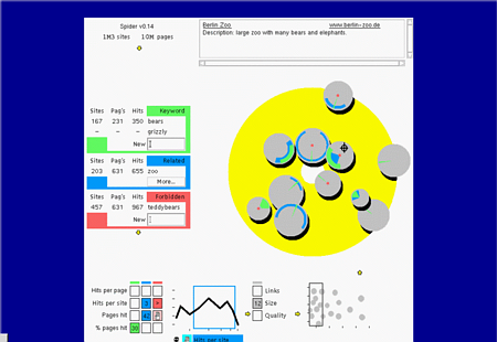
From "all" in the left-lop, we decent to the specification of keywords. Those are grouped into
- primary keywords (green)
- related words (blue)
- add depricated words (red)
Next to that, the limiters on the sites are shown. The display of the information related to that is on the same place as for the previous set of limiters, because screen space is limited.
After the selectors did their work, we get a small set of sites (hopefully), which have to be scanned. The right-bottom shows all sites in their relative ranking. The large yellow field show some of the sites, represented by circles.
Read the first paper for more details.
Mark A.C.J. Overmeer, AT Computing bv, 1999.